

I developed a portfolio website (this website!) from scratch, both as an information visualization and a self-reflective art piece.
The challenge
I set out to design portfolio that reflected both my work and my mind. In one sense, my portfolio is a data visualization of the work I’ve done. As I grow as a designer in different areas, particularly information design, I decided to restructre this information to show both the breadth and depth of my work. In another sense, my body of work is a reflection of who I am; the point of view that informs my sense of design and way of thinking.
Design and development
I began with a blank WordPress theme, customizing each page with PHP and CSS.
The analog counterpart of the digital portfolio is the sketchbook. The grid of the home page (top of previous page) references a dotted sketchbook page, augmented into data visualization; each dot is a link to recent portfolio piece. I used D3.js to set up the “sketchbook” grid on the home page.
A reminder of the designer “within” the sketchbook, a video capturing a moment of my sketching process comprises the background of the page. The video explodes with glitches every few seconds yet persists, reflecting both old finicky technology and my embrace of failures and distortions as part of the process of design.
I traveled to my favorite coffee shop and filmed myself working in my sketchbook. To create the glitches, I used Adobe Premiere to arrange the clips and an outdated version Ademux to create the glitches with a technique called datamoshing:
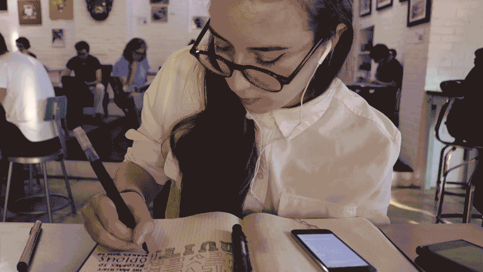
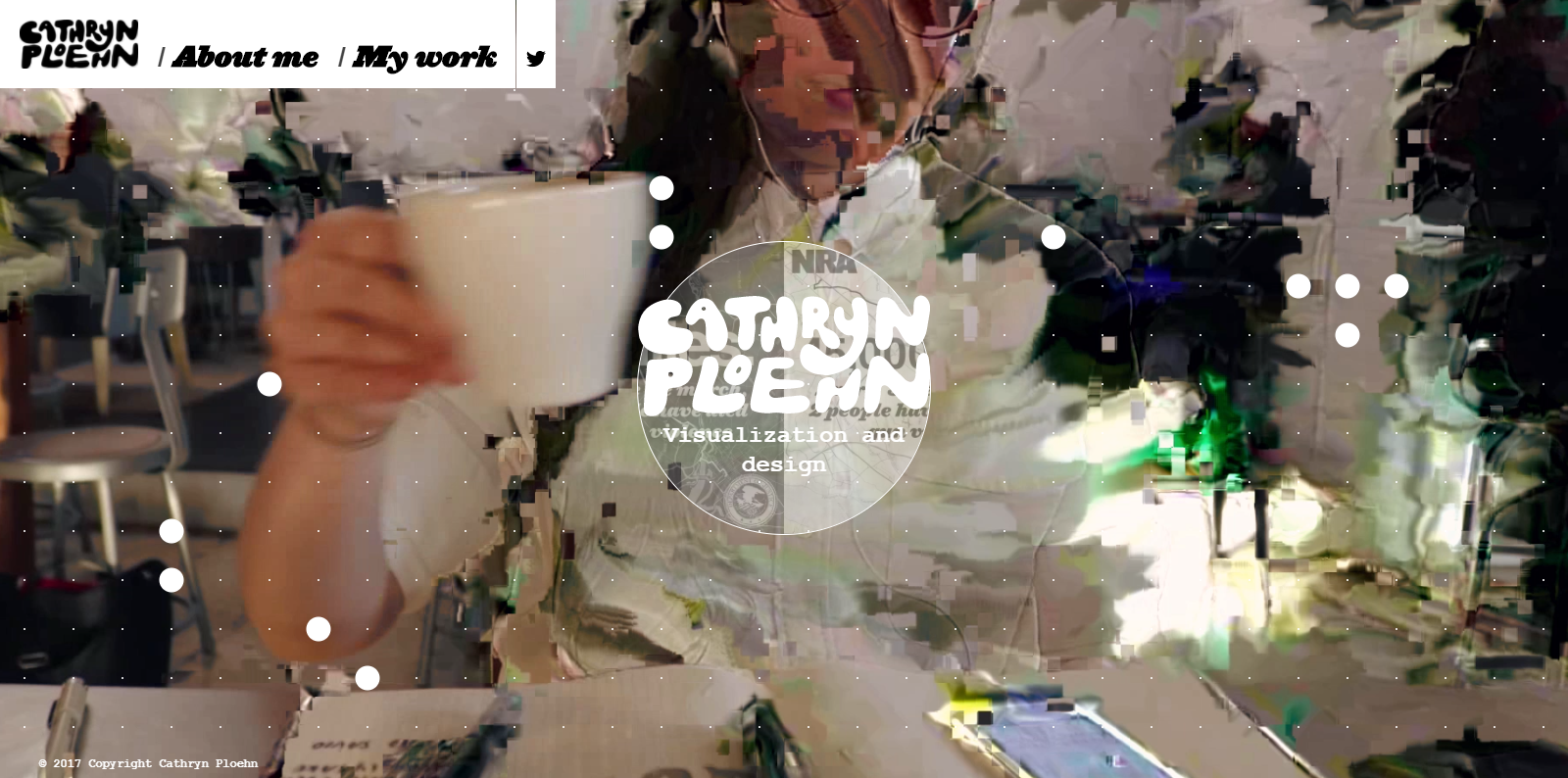
Datamoshing involves the removal of certain types of frames, which contains pixel transition information, from video files. When removed, a repetitive-type glitch is created.