I built a visualization tool to explore the intersection of usability and security metrics at the National Institute of Standards and Technology. The tool was published in proceedings of the International Conference on Human Aspects of Information Security, Privacy, and Trust at Human Computer Interaction International 2015.
One of the goals of the project was to compare comparing metrics like entropy (very theoretical measure of password randomness) with the number of keystrokes it takes to enter the keyboard in mobile devices (iOS, Android).
The challenge
How can password security be visualized?
Insight from text-based password usability studies conducted at the United States National Institute of Standards and Technology indicated a need for understanding how different aspects (or metrics) of passwords affected their overall strength (or security).
I was originally tasked with generating a tool to rearrange, or “permute,” randomly generated passwords into syllables to make them more memorable. I began to wonder whether the passwords, despite (theoretically) being more usable, lost a significant amount of their strength.
My goal was to create a visualization tool to discover the change in strength and usability between the original (randomly generated) passwords and the new (permuted) passwords. To allow for exploration, the tool is designed to be interactive and customizable.
Designing the tool
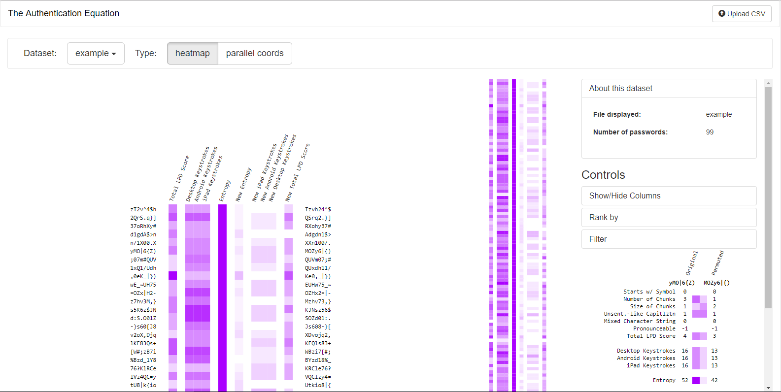
Humans perceive horizontal symmetry, such as facial symmetry, with ease. With this in mind, I initially envisioned displaying the different (numeric) metrics symmetrically, with metrics of the original passwords on one side and the permuted on the other. The numbers would be encoded visually with color.
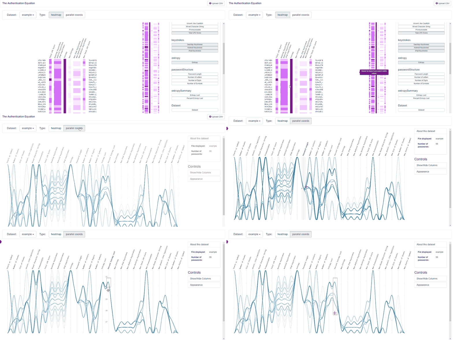
- Heatmap display of a password dataset, with each row displaying a password and each column displaying a password metric.
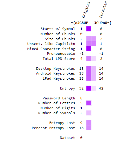
- Close-up of metrics for individual passwords.
Building the tool
First, I built a password “permuting” tool using Python. Then, I developed a browser-based tool with JavaScript (including D3.js) to handle file upload and visualization.
After testing the tool, I realized it couldn’t handle large (10,000+ passwords) datasets. Also, the heatmap failed to show the relationships between different password metrics.
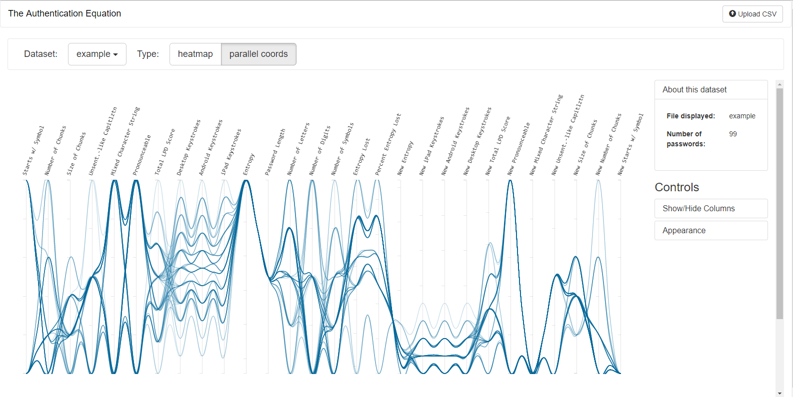
I learned about a new type of visualization suited to this task, parallel coordinates, and updated the tool to incorporate it.
- Parallel coordinates visualization, showing the relationships between password metrics.
Lessons learned
There can be a trade-off between usability and processing power. A script developed in R would have proved more powerful for exploring large (10,000+) numbers of passwords.
Presenting the tool at Human Computer International 2015
I had the privledge of presenting a talk on this project at this year’s (2015) Human Computer International conference in Los Angeles, California. Usability nerds unite!
The best part of any conference is the ability to attend a variety of talks on the breadth of work being done in the field. Brain computer interfaces continue to fascinate me.
The conference began with awards and an awesome keynote by Susan Dumais, Distinguished Scientist & Deputy Managing Director of Microsoft Research Lab. (of course artistic interpretation from a sleep deprived me ensued).
Personalized search: #sketchnotes from last night’s keynote at #hcii2015 pic.twitter.com/97whYZPuJv
— Cathryn Ploehn (@cathrynploehn) August 5, 2015
or read the paper in the HCII conference proceedings


