

I have the pleasure of serving as a design specialist for the National Heart, Lung, and Blood Institute, beginning in the summer of 2018.
I designed marketing materials for the institute and had the opportunity to create my own data visualization projects, including the creation a data visualization methodology to query, analyze, and visualize scientists’ contributions to the institute.
I designed for the Division of Internal Research (DIR), within the Office of the Scientific Director (OSD). The OSD oversees the research branches in the DIR, managing various programs.
A visualization methodology for communicating NHLBI research
I designed of a a visualization methodology for communicating the breadth and depth of the research NHLBI scientists tackle. I developed of an application to retrieve papers that principal investigators from the NHLBI had published from the PubMed api in the past year, analyzing and visualizing the resulting corpus of text.
PubMed
While the folks at the Division of Intramural (internal) Research (DIR) at the NHLBI are closely familiar with the breadth and depth of the research their scientists tackle, a data-driven project adds detail and evidence to that understanding.
I started with a prompt to manually search PubMed for the papers that each DIR program’s principal investigators (PI) had produced that:
- Were published in the last year
- Had the PIs as either first or last author
Then, I was to do a text analysis of the corpus of abstracts and design a visualization presenting that information. In other words, they asked for a wordcloud.
I’m aware of the controversy of using wordclouds – they don’t maximize data visualization design principles for accurate readability of the data they encode. Still, folks seem to love them.
Data collection
Instead of doing a manual search, I built a front-end application (read: vanilla Javascript) to do this for me. I envisioned data collection would be easier for other folks in the office wanting to retrieve PubMed data without needing programming expertise. Thankfully, PubMed has a decent API with documentation (Entrez Programming Utilities).
The PubMed allows access to academic papers via two different services. One service returns an ID of a paper when queried with parameters like Author name, etc. Another, using the same ID as its main search term, returns the details (authors, abstract, etc.) when queried with that ID.
The first step was gathering a list of paper IDs for each PI in the division. For each author, my application builds an API call for each PI that gathers a list of paper IDs.
The next step is to build an API call for each ID, verifying that the PI in question is the first or last author and is affiliated with NHLBI.
Finally, the data is displayed as a table in the browser.
Data analysis
This project marks my first time exploring text analysis. Using R, I began with the package TidyR. I began with three different types of text analysis:
- Count: How many occurrences of individual words exist in the corpus?
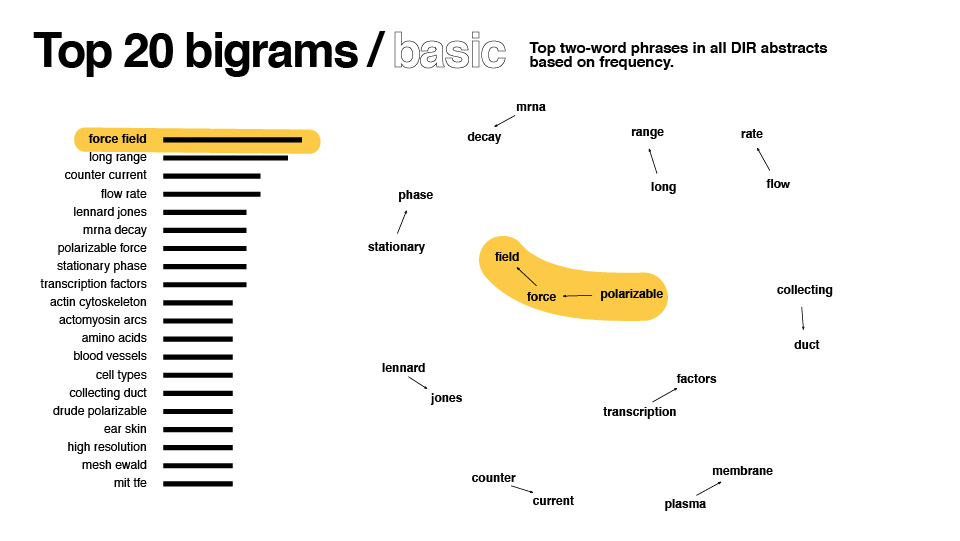
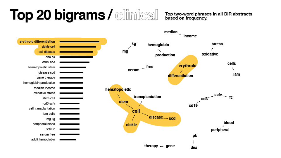
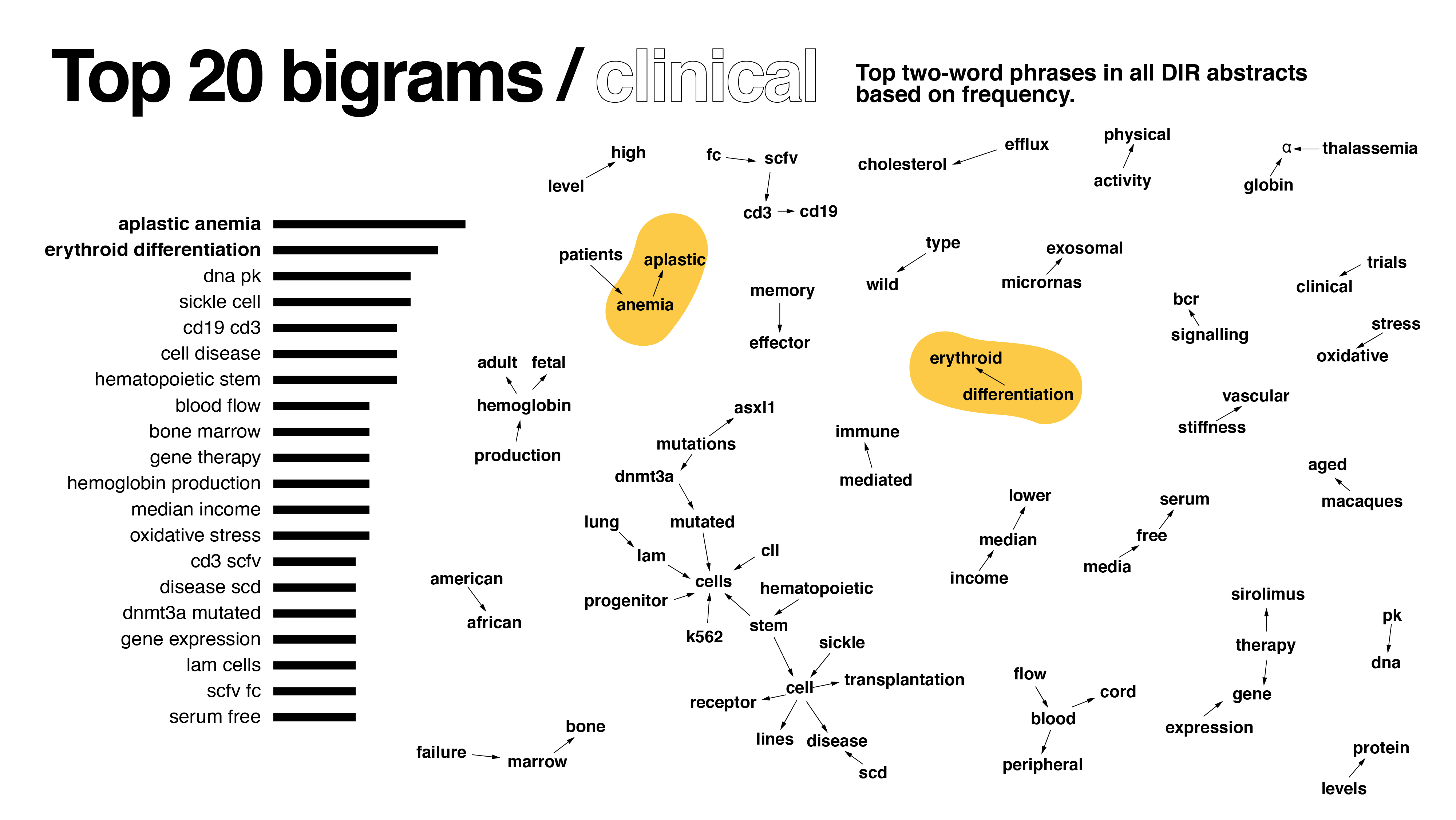
- Bigrams: Which pairs of words occur the most often?
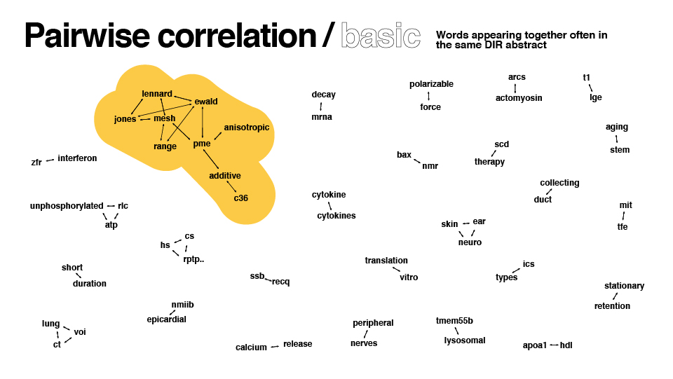
- Pairwise correlation: Which words occur the most often together in the same abstract?
Key to the analysis was removing words called “stop words,” such as “I”, “and”, or “is.” The TidyR package provides a large corpus of words, but I added a list of 50+ words on my own as I explored the data and found additional words to be filtered out.
Unfortunately, due to software install restrictions on gov’t computers, I wasn’t able to work with a few key R libraries and Photoshop. Instead, I had to make do with a lackluster wordcloud library.
After some redesign in illustrator, here are the results:

Data collection revisited
After talking with another person in the office – the possibility that I collected improper data became apparent. She noticed I was using only last name in my author search – there are several people with the same last name in the NHLBI who could have also been picked up by my search parameters. I needed to use both first and last name in my search.
I was also using “National Heart, Lung, and Blood Institute” as a search term, but I wasn’t double checking each paper to ensure the author I was searching for had an NHLBI affiliation. For example, if I searched for John Brown, I would capture papers with an author named John Brown (not NHLBI affiliated) with another author who was NHLBI affiliated. Instead, I would need to ensure the paper listed NHLBI as an affiliation for the author in question.
Data analysis revisited
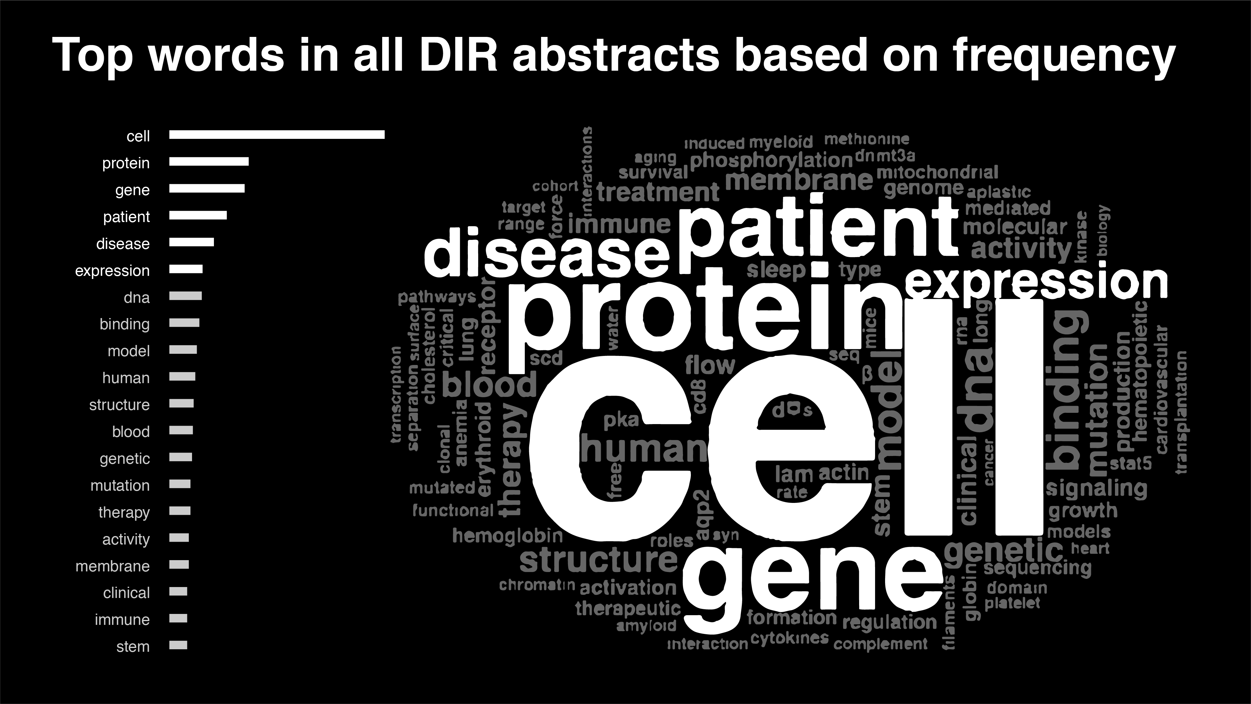
In a conversation about the project, we realized the different forms of the same word (protein, proteins) were treated as separate units of analysis. In this phase, I stemmed the corpus of words, reducing words to their root. For example, “diseased,” “diseases,” and “disease” would all be changed to “diseas.” Groups of words like “protein” and “proteins” would be treated as the same word in my analysis.
However, a key library in R (tm package) that allows stem completion, or returning stemmed words like “diseas” into their original “disease,” couldn’t be installed (again due to gov’t software restrictions). Because some folks later on found the word stems to be confusing, I had to forgo using word stemming altogether.
Redesign
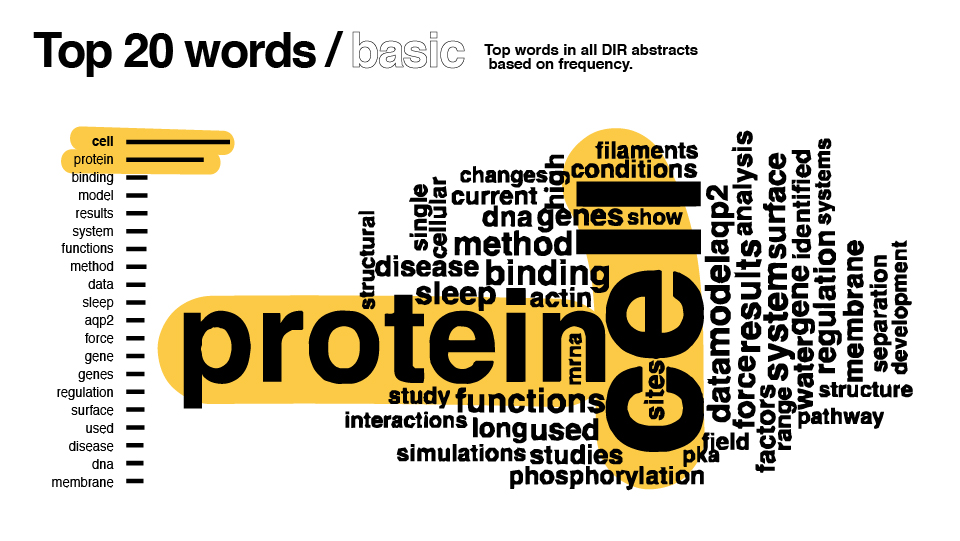
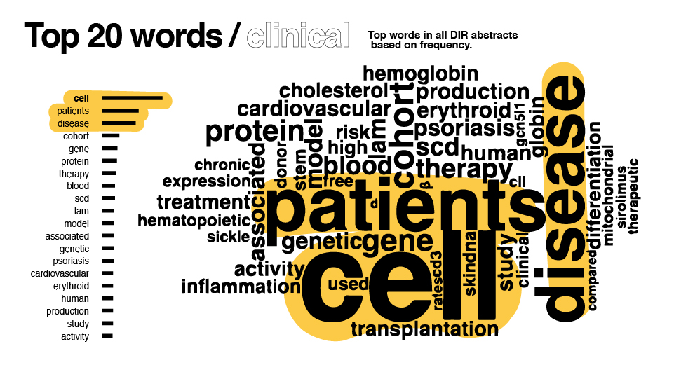
With these revisions in mind, I updated the code and produced new results:
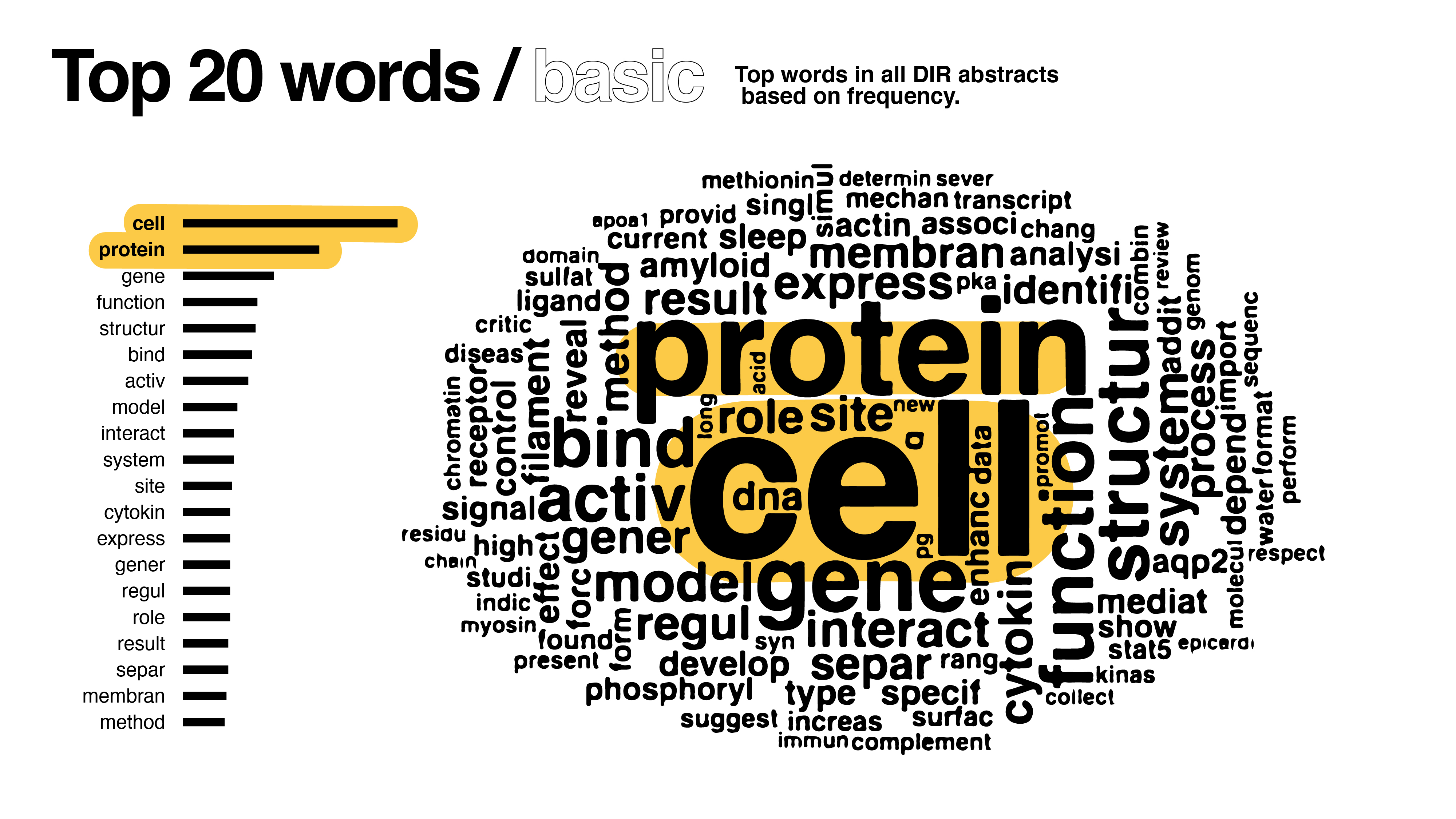
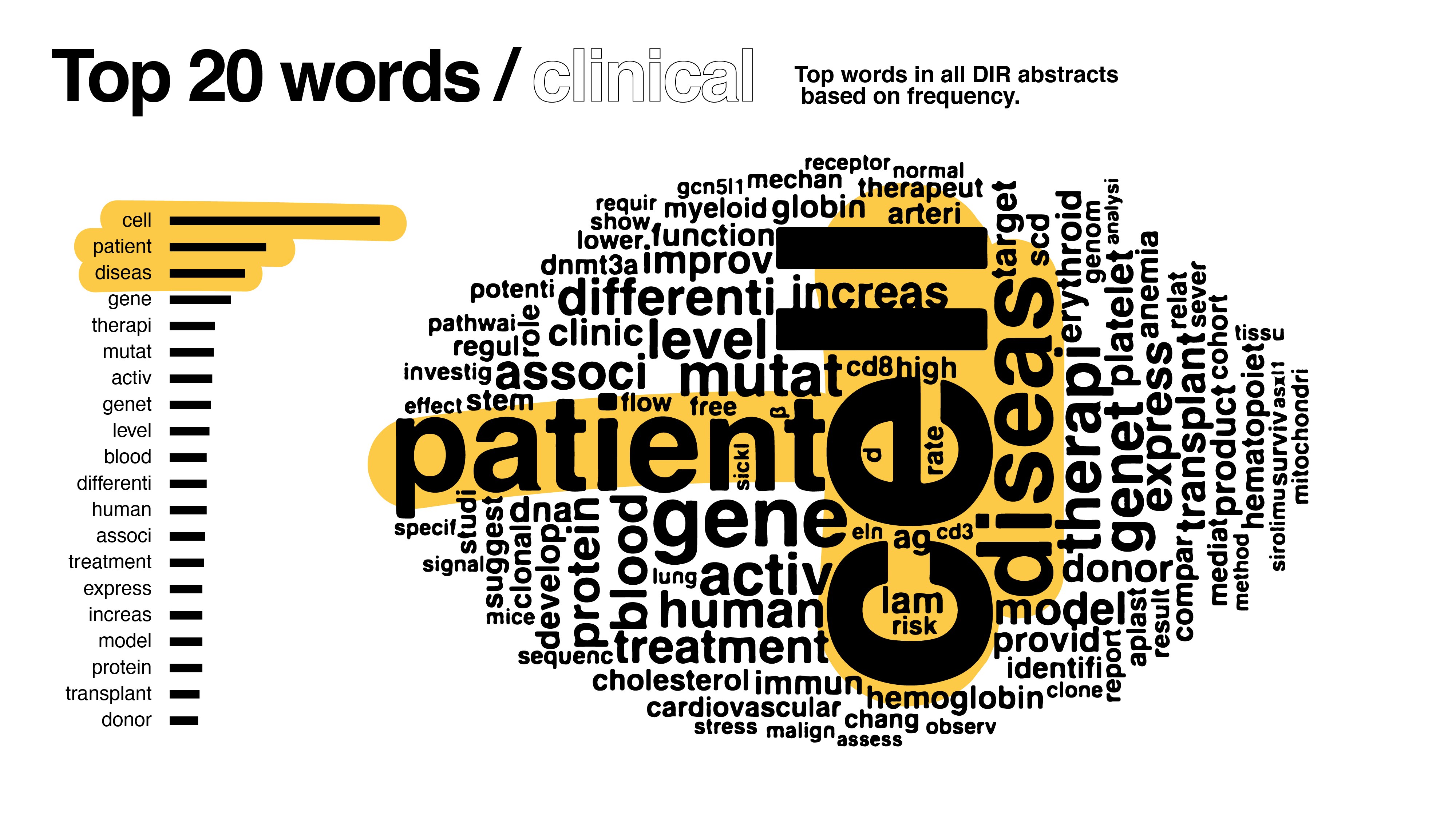


Compared to the first version, it’s clear how drastically the dataset shifted with my changes – the words cell and patient are not as pronounced.
Feedback
Upon showing the designs to supervisors, it became clear I went too far beyond the prompt in my text analysis. One of the key decision-makers looked at the bigrams and pairwise correlation graphs, simply stating “yeah, we can’t use this.” C’est la vie d’un designer. Nevertheless, with my newfound text analysis experience in tow, I found those graphs infinitely useful. Other feedback I received included:
- Given the results in the graph, clinical vs basic weren’t necessarily different enough to justify two graphs; find a total word count instead
- We wondered what type of diseases the DIR at the NHLBI worked on. To accomplish this, I’d filter the corpus of words by disease, repeat word count analysis
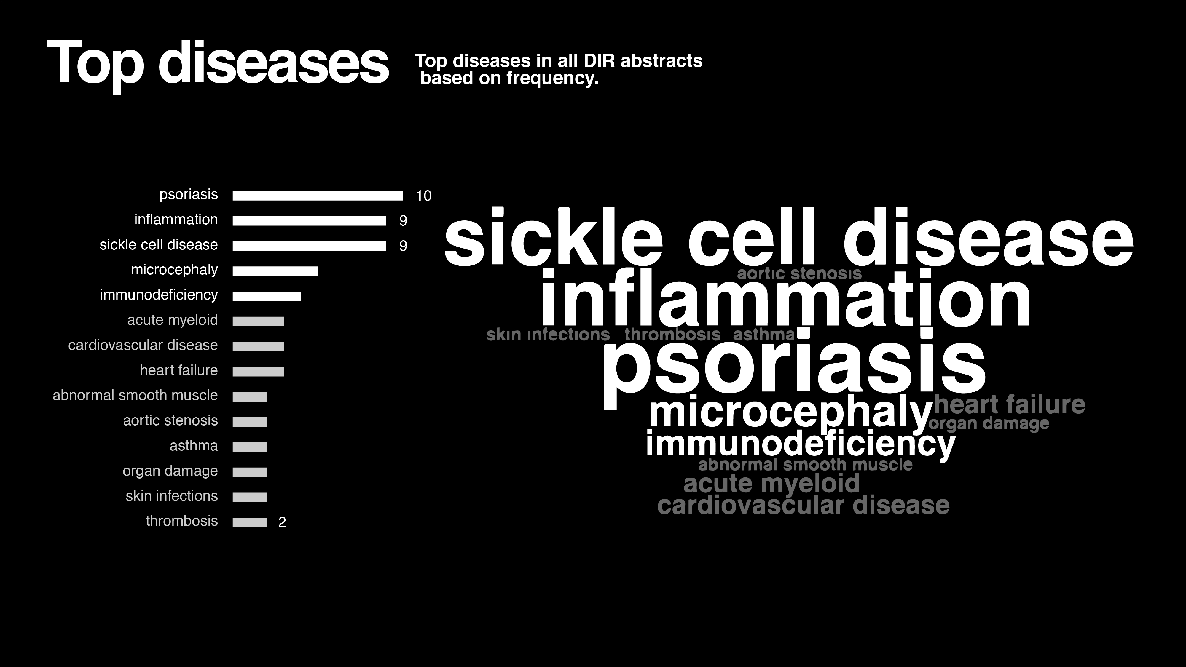
Disease
To filter the corpus of words by disease, I’d need a standardized list of diseases. I used the ICD-10 (10th revision of the International Statistical Classification of Diseases and Related Health Problems) as a reference for diseases.
I combined single words, bi-grams, and tri-grams to create the chart. Admittedly, there are fewer diseases in the abstracts than I expected. Inflammation refers to several types of inflammation (general, vascular, chronic) but none of these types were mentioned more than once (only diseases with 2 or more mentions are in the chart).
Conclusion
I produced final versions of the visualizations using a slightly different style:
In the end, the entire process of data collection, analysis, and visualization for text fascinated me. My main issue was lack of subject-matter expertise. Throughout the process, there was a discrepancy between my understanding of the corpus and that of my clients. It underlines the importance of working closely with an expert in this sort of data visualization project.
Additionally, I’m keen to use an alternative to word clouds and regret not having enough time working on the project to explore that option.
Marketing materials
The OSD manages projects such as symposia, conferences, and awards ceremonies. I created design materials for these events; managing edits between various levels of management.
Style guide
I was initially slated to create a logo for the OSD, but we were surprised by a restriction barring us to do so. The thought to create any other branding materials dissipated from the office. However, I set out to produce marketing materials in the same visual language across projects when possible.
By the end of the summer, my supervisor was excited by my suggestion to create a style guide based on the aesthetic precedents I had established.
I was inspired by the National Institutes of Health and the National Heart, Lung, Blood Institute logos:

The logos are geometric and contemporary. The logo font is the classic Helvetica. Also, the new carpet all the office members selected is a contemporary mix of colors:

I ended up with colors, font, and aesthetics that fit the mood of the office and still maintained cohesion:
-
- Text guidelines
-

- Logo usage
-
- Colors (inspired by the carpet!)
-
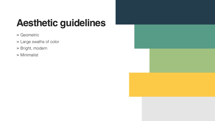
- Vibes
-
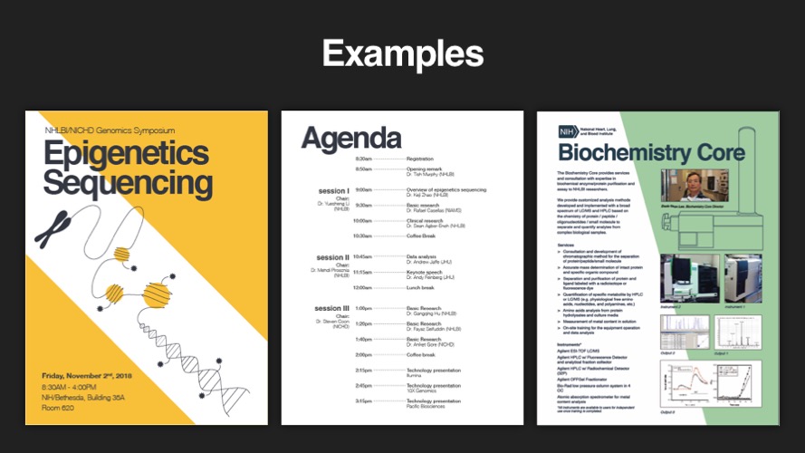
- Examples bring the aesthetic guidelines to life
Epigenetics Sequencing Symposium
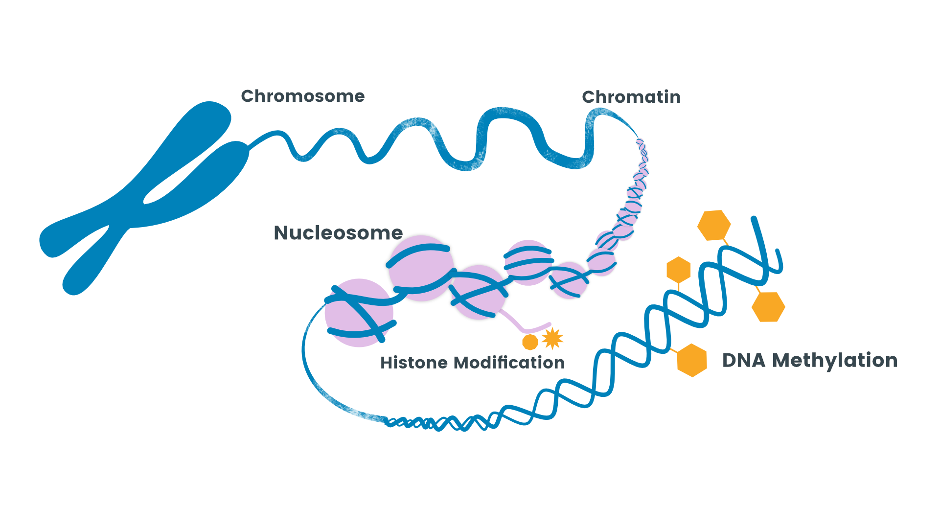
I was first captivated by the concept of epigenetics thanks to a SciShow YouTube video. I excitedly researched the concept after given a prompt to create designs for an upcoming NIH symposium.
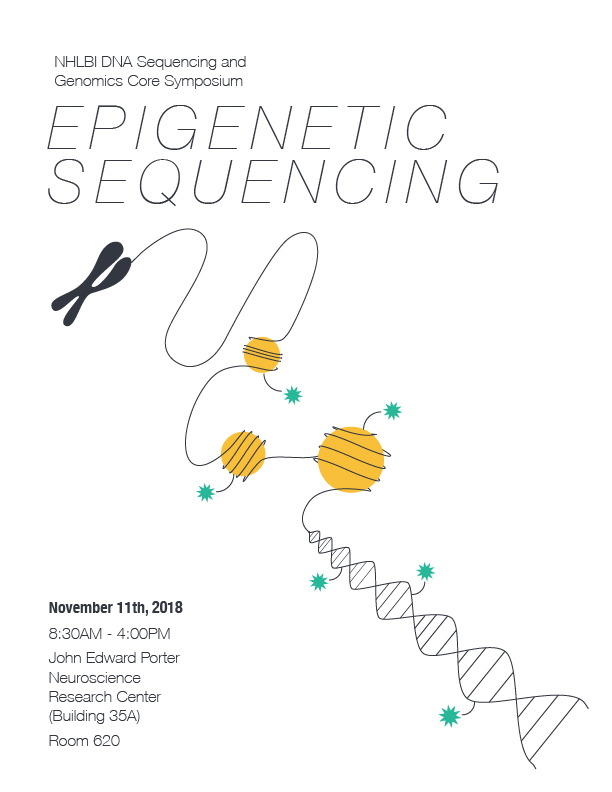
I set out to make a geometric and contemporary interpretation of the concept of epigenetics based on photos the organizers sent me:
Which, in logo form, ended up like this:

I was relieved to hear from the organizers, who are scientists studying epigenetics themselves, that I had an apt distillation of epigenetics. I produced a breadth of design options for my office, the OSD:
-

- Gray
-

- Super yellow
-
- Minimalist
-

- Trendy
-

- Microsoft Clip Art
To my surprise, the folks in the office liked “Gray” the most. Someone suggested I replace the gray with the same yellow from the other designs, which resulted in our final design:
-

- Small edits were made by others along the way.
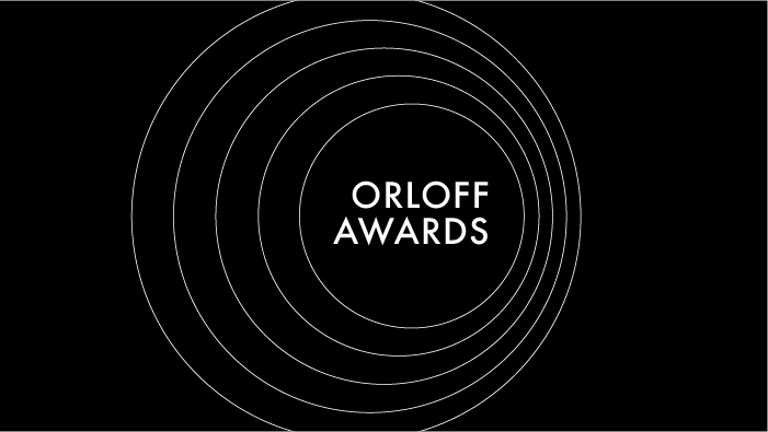
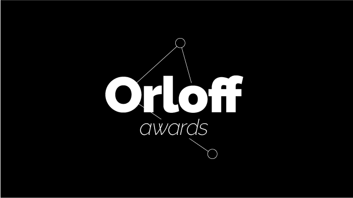
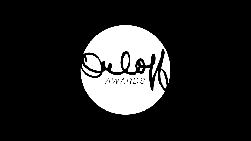
Orloff awards
The Orloff awards are an awards ceremony at the National Heart, Lung, and Blood Institute (NHLBI), named after Jack Orloff, NHLBI scientific director from 1974-1988.
The old design centered around a brush script, en vouge these days amongst the craft community. Given the focus on cells (see PubMed research) and the iconography of award ceremonies (spotlights), I centered designs around a circle.

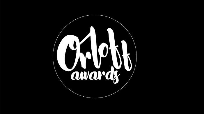
Folks in the office suggested we find an original copy of Jack Orloff’s signature to include instead of the brush script; a great idea.
Sickle Cell Conference
The Sickle Cell branch in the National Heart, Lung, and Blood Institute holds an annual conference, Sickle Cell in Focus (SCIF). In the midst of administrative shifts in the branch and a tight deadline, our office was asked for design materials and administrative assistance for the conference.
The on-campus “design firm,” MedicalArts, had already designed a flyer for the conference:
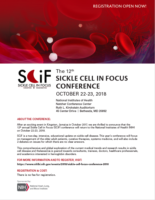
The first thing I noticed was the use of Futura font in the SCIF logo, informing my use of the font throughout the design.
The second noteworthy aspect of the logo was the iconic sickle cell. The unique shape of a sickled cell stood out to me; a moon (instead of a the normally shaped disk). I remembered the other Sickle Cell related posters I often saw during work hours focused on the sickle cell shape. Thus, I peppered the sickle shape throughout the design:
-

- Cover v1. Crowd favorite.
-

- Cover v2. My favorite.
-
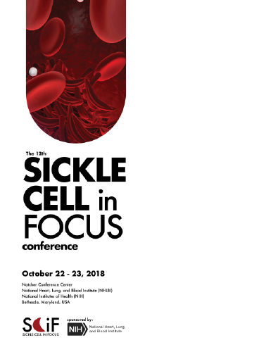
- Cover v3. Cutesy.
-

- Sample of internal spread.