
Created by Cathryn Ploehn, Molly Steenson, and Daragh Bryne for the IEEE VIS Arts Program. Read the paper.
Data visualizations are incredible at opening space for good conversations. By making visible what we know, they allow us to understand and talk about unseen patterns and connections, giving them the potential to enchant us through showing us new ways to engage with the world, transforming us for the better in the process. However, critiques of data visualization demonstrate how our theories and practices fall short of this promise, leaving us engaging with the world in a (potentially violent) mode of control.
To address this we begin by redefining data and data visualizations theoretically, through an ecological and feminist lens. By reframing data visualization as ontological, and data as observed phenomena, how might practices and theories change? We embarked on a research through design project, creating Tsuga Convictio, an experimental data collection and data visualization to support community conversations in the Carnegie Mellon School of Design masters’ Cohort. In other words, we asks whether new practices, instead of analytical ones, can emerge as we design for these emotion-driven conversations.
These experiments revealed answers to some of the fundamental questions designers implicitly (and explicitly) address when they collect data and create data visualizations, practices and principles already emerging in designing data viz and which may help the field live up to its potential. With these principles and practices, we can begin talking about how to push forward our data visualizations--creating visuals that, rather than control and fragment--inspire, engage, and transform us for the better:

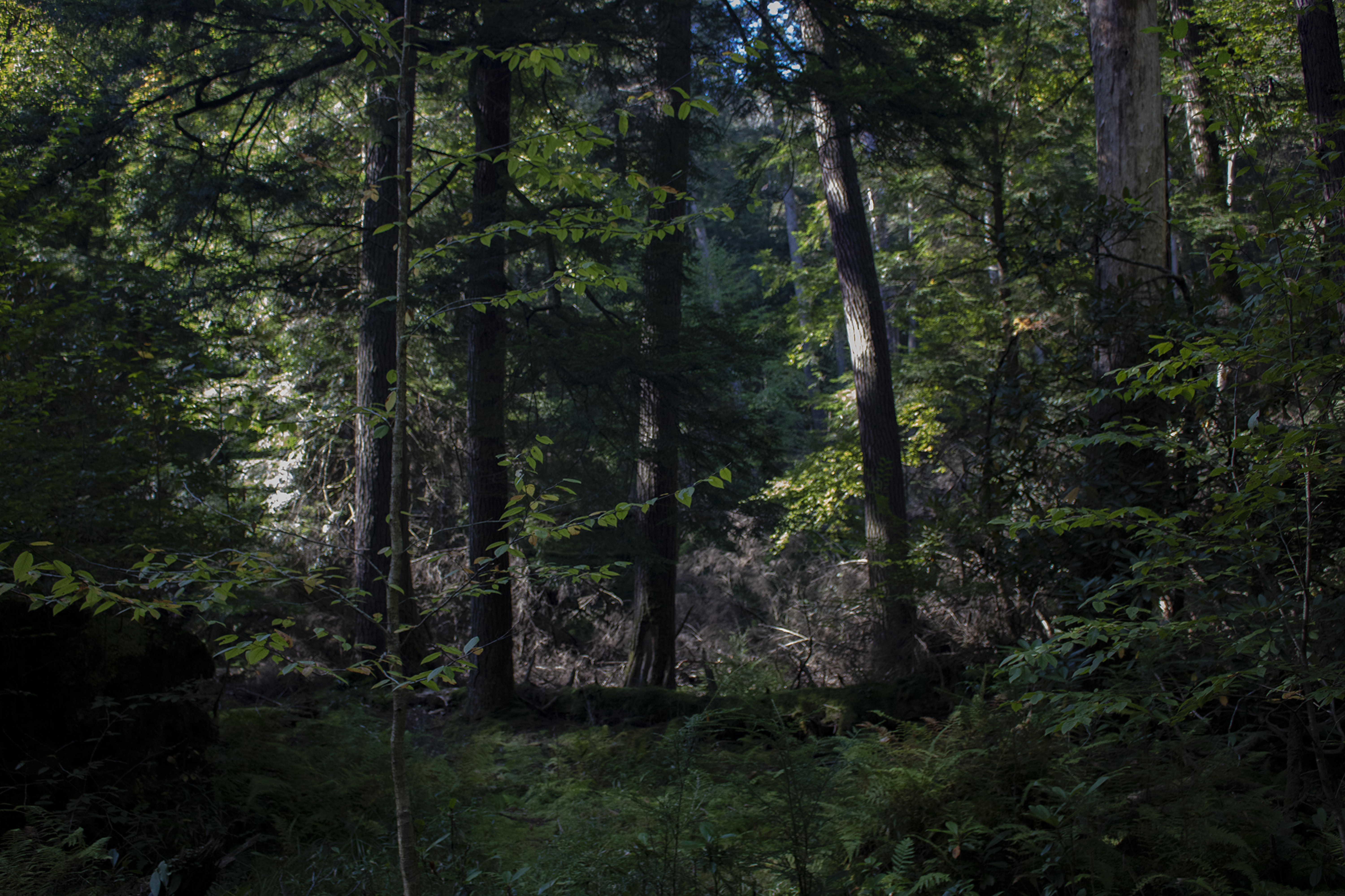
Prototypes of the data collection and visualization experiments are below, which began with beholding the old growth forests of Western Pennylvania.

We aimed to create a data collection process for community conversations that is reflective, poetic, and non-extractive. We created a data collection process that invites participants to reflect on their felt experience in the masters’ design community through the metaphor of growth of hemlock tree roots in Western Pennsylvania’s forests. They reflect using a hand gesture of reaching or clenching, and can preserve their gesture as data using a phone’s webcam, which uses a neural network regression to map hand movement to the ”vivaiousness” of root growth:
We aimed to create a data collection process for community conversations that is reflective, poetic, and non-extractive. Through making this prototype, we discovered that creating data can be a process of noticing, observing, and listening by carving out space and time to notice how the body feels, incorporating ecological narratives. In our prototype, noticing the body (and what it feels) becomes the center of attention—that tightness in the chest, the nausea in the stomach. The scale of meaning is tied to a unique body, so multiple interpretations of the gesture are built into the framing of the data.


We created a prototype that visualizes data through a generative system forest, whose volume of root growth metaphorically represents the state of the community. In the prototype, each tree in the forest represents a community member, with their level of ”vivaciousness” mapping to system behaviors that drive how enthusiastically each trees’ roots grow, such as how many times a root can split.
The visualization was created towards helping us behold (instead of analyze) the world around us in the context of community conversations. Through making this prototype, we discovered that we can choose which data to visualize to guide a particular kind of to conversation emerge. Even further, when we create data visualizations, we can create visuals that can give a deep, visceral understanding of our data by choosing an ecological metaphor, brought to life with generative systems and an ambiguous form.
Legend

With practices like these, we can design data visualizations for conversations that help us develop a lens for noticing, or beholding the world our data represent. Using aspects of dramatization in data visualization is not only for the sake of artistic value. By designing visualizations for felt experience, upon which all our knowledge is based, those visualizations actually become more meaningful than their abstract, geometric counterparts. By designing data visualizations using ecological metaphors inspired by our bioregion, we can connect ourselves and appreciate the land we reside in. Finally, ambiguity allows our data and visualizations to be flexible, open to interpretation:

This research offers a step towards a practice of crafting visualizations that contribute to critical conversations. When we look at the failings we have in the kinds of conversations that emerge from our data visualizations, the need to address how data visualization impacts how we relate to the world is critical. We must not only develop new practices that bring the bodies back to data visualization, but embrace how data visualizations can be a tool for beholding the entanglements we have world around us, creating the conditions for belonging we yearn for.
What can a good data visualization do? Or, what can be accomplished with ontological data visualization? Good data visualizations enable us to have transformative conversations by holding space for multiple ways of knowing about the world (ambiguity), giving us a chance to viscerally understand, or have a feel of, the world, and by giving us a visual record of the intangible patterns that surround us.
For updates on this work, follow Cathryn Ploehn on Twitter or sign up for her newsletter